Alright, let’s dive into this whole “yeezy szn” thing. Basically, I was messing around with trying to replicate some of the visual styles and aesthetics associated with Yeezy’s design language. It’s a mix of minimalism, brutalism, and a touch of dystopian futurism, if you ask me.
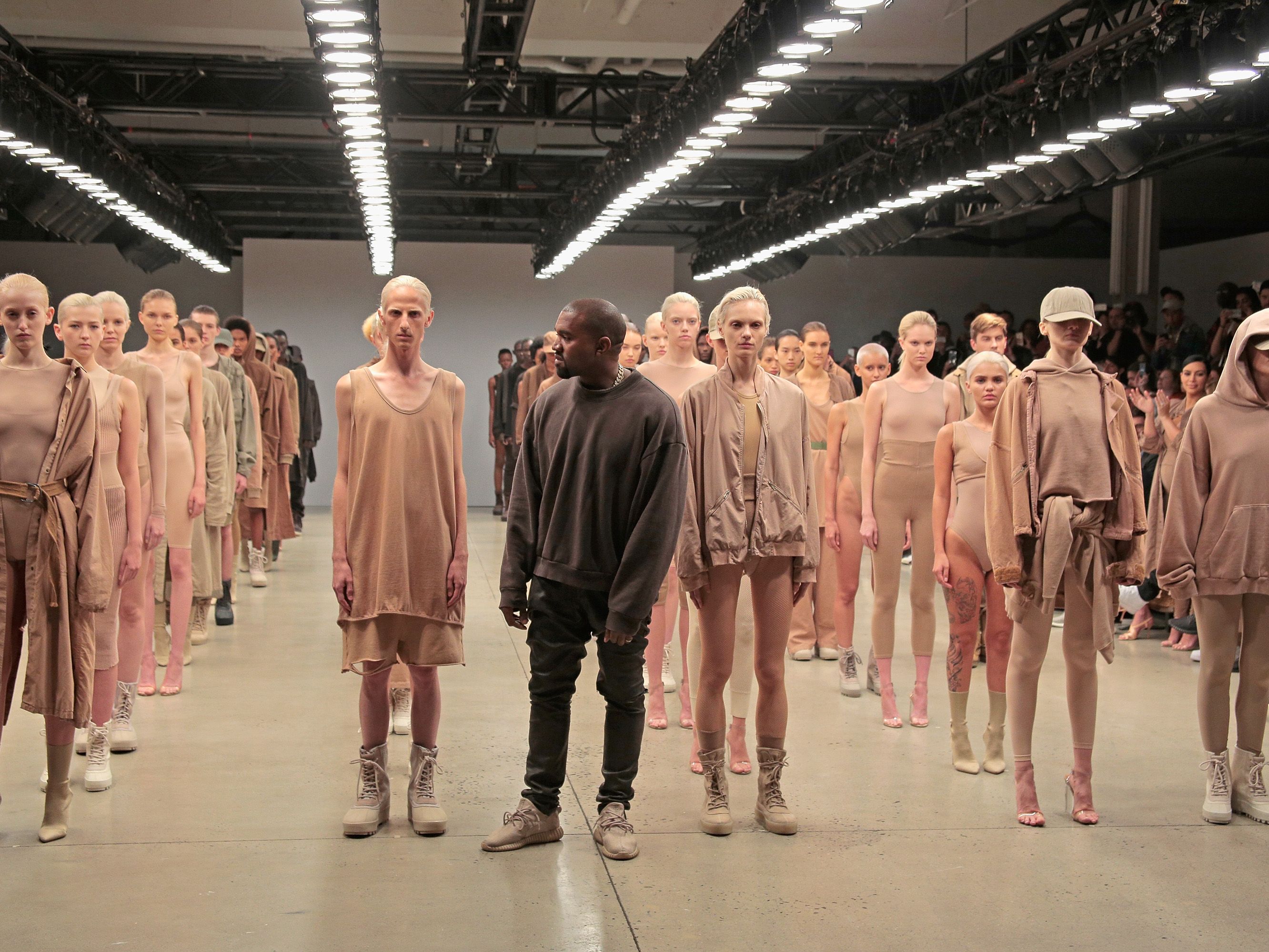
First, I gathered inspiration. I wasn’t just gonna wing it. I spent a good chunk of time scrolling through images of Yeezy clothes, shoes, and even his architectural projects. I paid close attention to the color palettes – lots of earthy tones, muted grays, and blacks. The silhouettes were often oversized or boxy, and the textures were usually rough or raw.
Then, I started sketching. Simple stuff, really. Just playing with shapes and forms. I was trying to capture that feeling of utilitarianism and functionality, but with a high-fashion edge. Think simple geometric shapes, asymmetrical designs, and a focus on the materials themselves. I was doodling on my iPad, nothing fancy.
Next up was the fun part: picking the right tools. For this project, I decided to use Blender. I’m not a pro, but I’m comfortable enough with it to get my ideas across. I also used Substance Painter for texturing, which helped me achieve those realistic, worn-out looks that are so central to the Yeezy aesthetic. For the color grading, I used Photoshop.
With Blender, I blocked out the basic shapes. I started with a simple cube and began extruding, scaling, and rotating faces to create the overall form I had in mind from my sketches. I was aiming for a sort of industrial-looking bench with sharp edges and a slightly unsettling vibe. Think concrete bunker meets minimalist art installation. I made sure to keep the poly count relatively low, as I wanted it to look a bit rough and unfinished.
After the basic shape was done, I moved on to texturing. This is where Substance Painter came in clutch. I imported my model and started experimenting with different materials. I used a combination of procedural textures and hand-painted details to create a worn concrete look with subtle variations in color and roughness. I added some grime and imperfections to give it a more realistic feel. Like it’s been sitting outside for ages.
Lighting was key. I wanted to create a dramatic, almost theatrical atmosphere. So, in Blender, I set up a simple three-point lighting system with a strong key light to highlight the details of the texture and a couple of fill lights to soften the shadows. I also added a subtle rim light to separate the object from the background. I spent a long time tweaking the light and colors until I got the feeling I wanted.
Finally, I brought the render into Photoshop for some post-processing. I adjusted the colors, contrast, and saturation to give it that gritty, desaturated look that’s so characteristic of the Yeezy style. I added a subtle vignette to focus the viewer’s attention on the object and a touch of film grain to enhance the overall texture. Honestly, this part is all about gut feeling, just fiddling with the settings till it looks right.
And that’s pretty much it. It was a fun little exercise in trying to emulate a specific design aesthetic. I’m happy with the result. Could it be better? Sure. But, I learned a lot in the process, and that’s what matters.