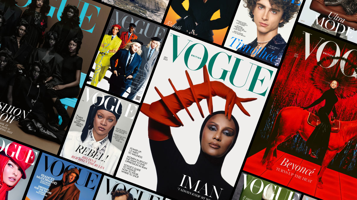
Okay, so I was messing around with this idea for “Vogue Ads,” just for fun, you know? I wanted to see if I could whip something up that looked kinda like those super polished ads you see in Vogue magazine. Nothing professional, just a little side project.
First, I spent some time, probably too much time, just scrolling through actual Vogue ads. Like, I went through a bunch of old magazines and websites. I was paying attention to the overall vibe, the way they use fonts, and how the photos are laid out. It’s all about that high-fashion, minimalist feel.
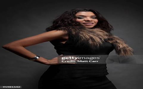
Next, I needed a picture. I am not a model, you know. And I also don’t have pretty clothes. I chose one photo I had taken before, in a good quailty at least.
- Cropped the image.I just wanted a close-up, head-and-shoulders type of shot.
- Bumped up the contrast. Make it look more dramatic, I think.
- Converted it to black and *, you know, fashion.
What I have done:
Then came the text. This part was surprisingly tricky. I realized that Vogue ads don’t use a lot of words. They’re all about that “less is more” thing. I played around with a few different fonts. Finally picked one that looked classic and elegant, not some crazy, wild font.I just typed in a fake brand name and the word “Collection” underneath it. Just for a testing.
After everything setting down. I have exported the image to JPG file. Boom. Done. It’s totally amateur, but I was pretty happy with how it turned out. It actually kinda looks like a real ad! Well, sort of. At least it gave me a good starting point for future experiments.
It was a good time. It is a very intersting thing that I have done. I might try making a whole series of these, maybe playing with different styles and layouts. It’s a fun way to practice some basic design skills, and who knows, maybe one day I’ll be able to create something that actually does look like it belongs in Vogue!