Actually this whole thing started last Tuesday when I was trying to design a new logo for my blog’s rebrand. Man, I kept hitting a wall, you know? Felt like everything I did looked kinda… soulless. Just flat shapes on a screen. Even my cat looked bored staring at it.
The Messy Beginning
So I got annoyed. Like, really annoyed. I shoved my laptop away, knocked over my cold coffee (of course), and while mopping it up with paper towels, I saw this old design book under my desk – covered in dust and coffee drips now, brilliant. It was my grandpa’s, full of weird 80s graphic design stuff. On a total whim, I started flipping through the sticky pages.
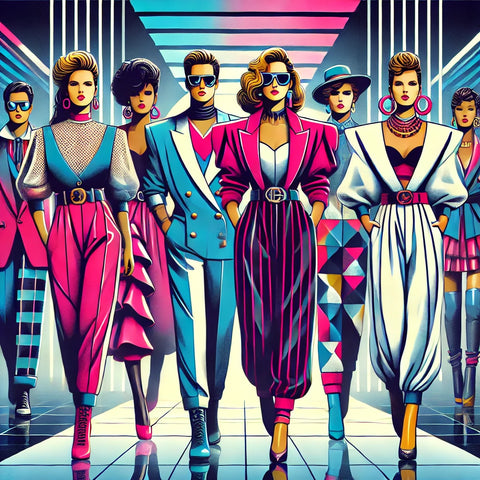
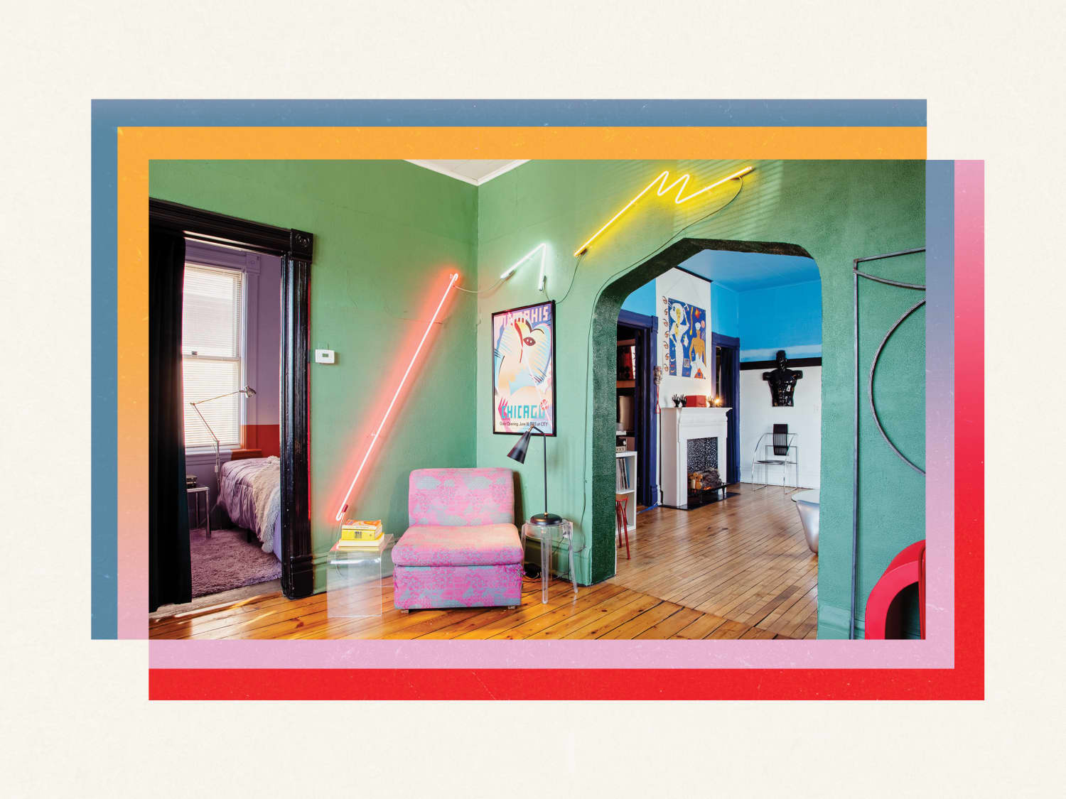
It looked wild. Like:
- All those clunky grid patterns everywhere, like someone went ruler-crazy.
- Those super bright neon colors that practically vibrate off the page. Seriously, retina burn.
- Weird, chunky fonts that looked like they were made out of building blocks.
- Hand-drawn stuff right next to basic computer shapes. Messy but alive.
Getting My Hands Dirty (Literally)
I thought, “What the heck, let’s try it like THEY did.” Dumb idea? Probably. I grabbed actual paper, real pens, markers that smelled weirdly chemical-y – none of that fancy digital tablet stuff. I forced myself to NOT use undo. Mistakes stayed. It was terrifyingly permanent.
Started trying to copy some of those blocky layouts and obnoxious color combos. Slapped down some thick marker lines for borders. Used a compass and ruler like some old architect. Drew a wonky shape for the logo. It looked kinda ridiculous. Kinda… cool? Not polished, but it had some weight to it. You could feel it was made by an actual person with shaky hands.
From Paper to Screen (The Fight)
Okay, time to bring this ugly baby into the computer. Took a photo with my phone – bad lighting, shadows, the whole deal. Didn’t clean it up much. Just scanned it in rough.
Then came the wrestling match with my design program:
- Instead of a clean vector shape, I used that bumpy, uneven scan as the main shape. No smoothing!
- Picked colors straight from the bright mess on paper, didn’t soften them down to modern pastels.
- Used that ugly Times New Roman font… but then messed with it. Stretched it, put outlines on it like some cheap sign painter. Felt naughty.
- Imposed a rigid, visible grid over everything. Like shouting “I AM ORGANIZED!” while dripping marker ink everywhere.
The Weird Punchline
Stared at the screen. Huh. It wasn’t slick. It wasn’t minimalist. It wasn’t anything close to what you see in fancy design galleries today. But… it had something. Energy? Guts? A weird confidence from just owning its clunky, awkward style.
Showed it to a buddy. He squinted: “Looks like an old soda can… but I kinda like it? It’s different.” Exactly! Different. Standing out in a sea of super-smooth digital perfection mattered.
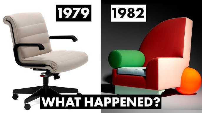
That got me digging into why the 80s guys were so good at making memorable stuff. Turns out:
- Everything was tactile back then. No delete key. Mistakes meant starting over or fixing it physically. That pressure made you commit.
- Tech was limited (and expensive!) So they fought it. Made the limitations part of the style. The grit from cheaper printing? They used it.
- Boldness was necessity. With no internet algorithms pushing your work, how else would you get noticed across a crowded room? You had to yell visually.
So Why Bother With These Old Dudes Now?
Felt like a lightbulb went off. Not a perfect designer bulb, more like one of those cheap flickering ones. Today, it’s way too easy to make something smooth, clean, and forgettable. We rely so much on perfect digital tools and tired trends. Looking back at the 80s mess reminds us:
- Imperfections have soul. That hand-drawn wobble, the color bleeds, even mistakes – they scream “human was here.”
- Limitations breed creativity. Having fewer tools makes you think harder about how to use them differently. Forces innovation.
- Be bold or be ignored. Those loud colors, thick lines – they grabbed you. A tiny whisper on a website won’t cut through the noise.
They didn’t just make cool posters. They made designs with guts. Designs that made you feel something – even if it was just confusion at first. In our hyper-polished digital world, we need a bit more of that messy, loud, human punch.