Alright folks, gather ’round! Today I’m gonna spill the beans on a little project I tackled recently: messing around with creating images that look like they’re straight out of the 70s. It was a fun dive into retro vibes, and I learned a bunch along the way.
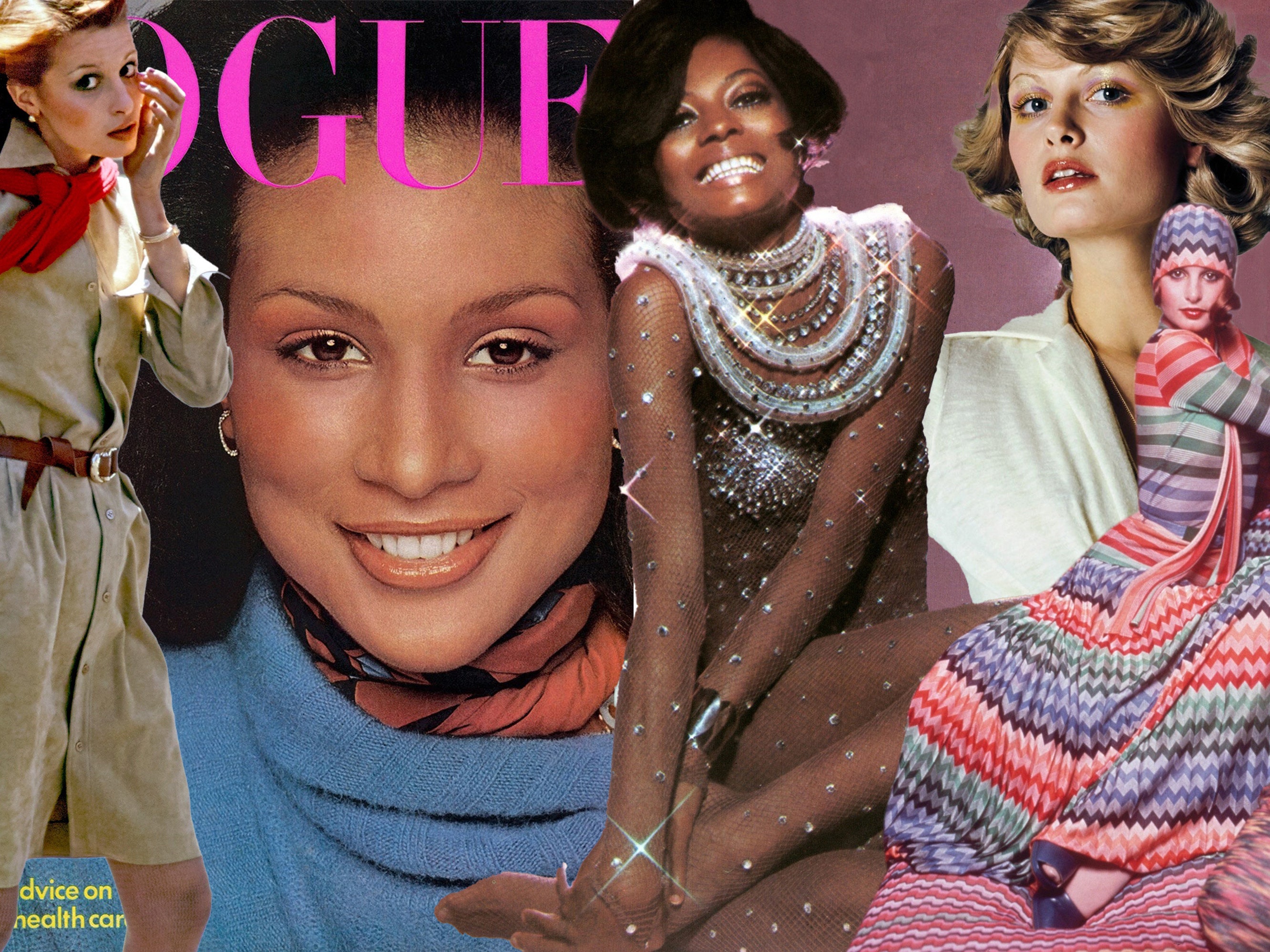
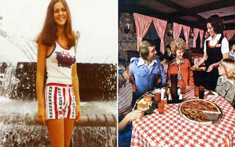
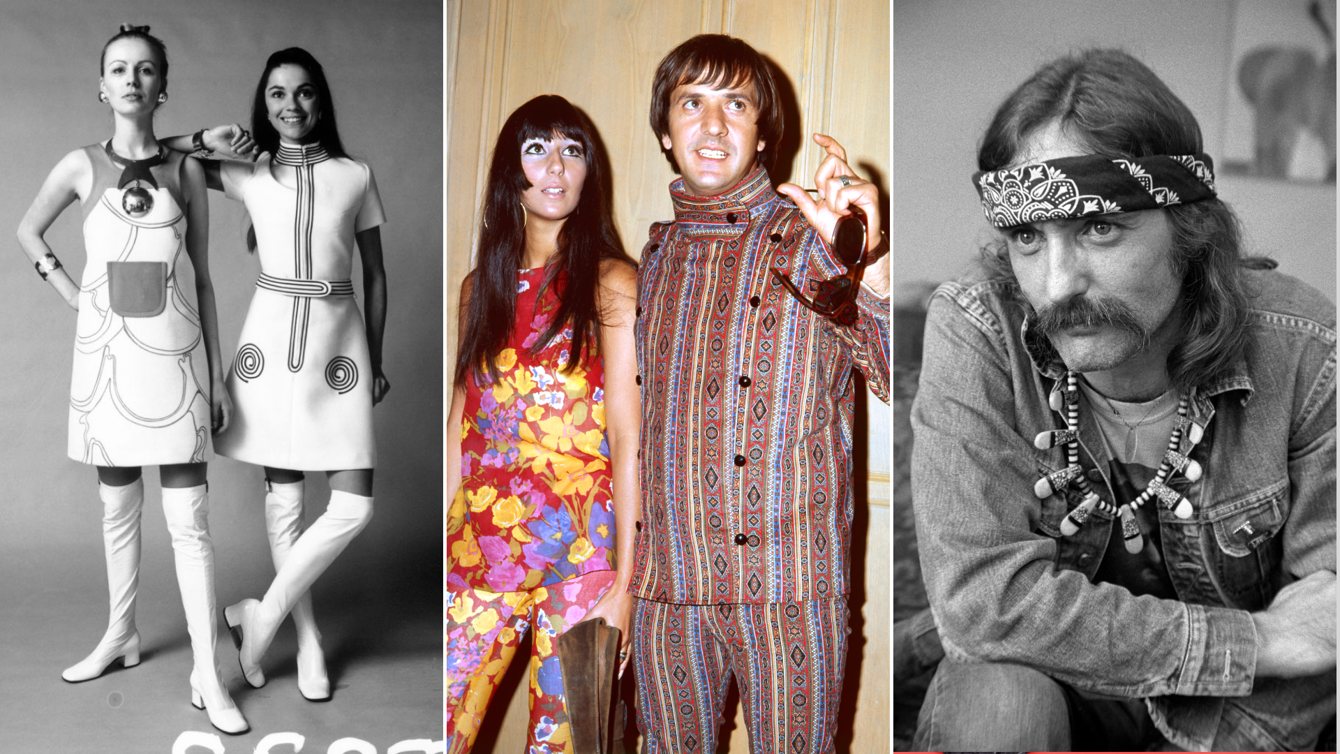
First things first, I started by scouring the internet for inspiration. I mean, what screams ’70s more than bell-bottoms, shag carpets, and a whole lotta brown and orange? I saved a bunch of images – old magazine ads, album covers, even family photos – to get a feel for the color palettes, the graininess, and the overall aesthetic.
Next up, I fired up my trusty image editing software. I won’t name names, but let’s just say it’s a popular one that everyone and their grandma uses. I knew I wanted to start with a relatively modern photo, something with decent lighting and composition, and then mess with it until it looked like it was taken with a Polaroid in 1975.
The first thing I did was kill the sharpness. Modern cameras are just too darn crisp! I applied a healthy dose of Gaussian blur, just enough to soften the edges and make everything look a bit dreamy. Then, I cranked up the noise. Think of it as adding a layer of static to the image. The more the better! Okay, maybe not too much, but you get the idea.
Color was the next big thing. The 70s were all about warm tones, so I played around with the color balance, pushing the reds, oranges, and yellows. I also messed with the saturation, bringing it down a bit to give the colors a faded, almost washed-out look. This is key! Think sun-bleached denim and vinyl records that have seen better days.
After the colors, I added some vignetting. This is where the edges of the image are darkened, drawing the eye to the center. It’s a classic trick that was often a side effect of older lenses, but it adds a lot of character. I also experimented with chromatic aberration, which is that weird color fringing you sometimes see around high-contrast areas. Again, it’s technically a flaw, but it adds to the vintage feel.
But the real magic happened when I started playing with textures. I downloaded a bunch of free textures – things like scratches, dust, and light leaks – and overlayed them on top of my image. I messed with the blending modes (multiply, overlay, screen, etc.) until I found something that looked just right. This is where you can really get creative and add your own personal touch.
Iterating was key! I’d tweak one setting, then another, then step back and look at the image with fresh eyes. Sometimes I’d go too far and have to dial things back. Other times, I’d stumble upon a happy accident that took the image in a completely new direction.
After a few hours of tweaking and experimenting, I finally had a few images that I was happy with. They weren’t perfect, but they definitely had that 70s vibe. I even printed one out on some matte photo paper to give it that extra bit of authenticity.
Here’s the thing I learned: recreating a specific aesthetic isn’t just about following a set of rules. It’s about understanding the underlying principles and then experimenting until you find something that feels right. So, get out there, mess around with your photos, and see what kind of retro magic you can create!