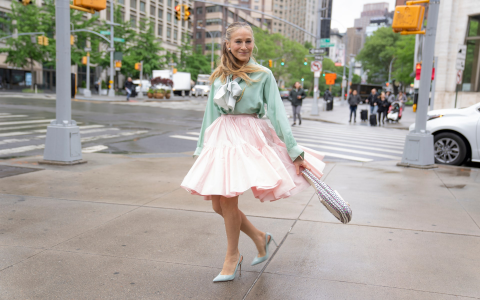
Okay, so today I’m gonna walk you through how I tackled the issue of making images look bolder on my website. It was kinda bugging me how some pics just looked washed out, especially on certain devices.

First thing I did, naturally, was jump onto Google. I searched for stuff like “make images bolder CSS” and “image contrast tricks.” Scrolled through a bunch of Stack Overflow threads and some random blog posts. Got some ideas about using CSS filters.
Next up, I fired up my code editor. I figured I’d start with the simplest thing first: the contrast filter. I went into my CSS file and added this to the relevant image class:
.my-image {filter: contrast(1.2);
That bumped up the contrast by 20%. Saved the file, refreshed the page, and… well, it was okay. Some images looked better, some looked kinda weird. The highlights were getting blown out on some of them. So, contrast alone wasn’t the silver bullet.
Alright, time to get a little fancier. I remembered reading something about using brightness and saturate together with contrast. The idea was to boost the color a bit and darken the shadows without making the highlights too harsh. So I tweaked the CSS to:
.my-image {filter: contrast(1.1) brightness(0.9) saturate(1.1);
Okay, that was closer! The images were definitely punchier. But still, some pics looked a bit… off. It seemed like the best settings depended on the image itself. Which meant I couldn’t just slap this CSS on every image and call it a day.

Here’s where things got a little tedious. I decided to create different CSS classes for different types of images. For example, I had one class for product shots, another for landscape photos, and so on. Then, I played around with the filter values for each class until I found something that looked good. It was a lot of trial and error, tweaking the numbers, refreshing the page, and repeating.
Another thing I tried was using image editing software (like GIMP, since it’s free) to pre-process some of the images. I’d bump up the contrast and saturation a little bit before uploading them to the website. This helped, but it also added extra steps to my workflow.
In the end, I landed on a combination of CSS filters and pre-processing. For most images, the CSS filters did the trick. But for a few stubborn ones, I had to edit them manually. It wasn’t a perfect solution, but it was good enough for now.
The key takeaway for me was that there’s no one-size-fits-all solution. You gotta experiment and see what works best for your specific images. And don’t be afraid to get your hands dirty with a little image editing.
Oh, and one last thing: always test your website on different devices and browsers! What looks good on your laptop might look terrible on someone else’s phone. I used the developer tools in Chrome to simulate different screen sizes and resolutions. It’s a lifesaver.


