
Alright, so everyone knows Valentino red, or at least they think they do. I sure thought I did. So I decided, hey, let me try to get a piece of this legendary color. Maybe a notebook, a scarf, something small. This was my little project, my practical attempt to nail down this famous red.
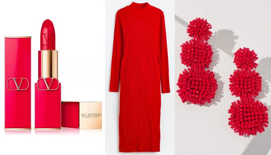
First thing I did, I hit the internet. Typed in ‘Valentino red’. Bam, millions of images. Dresses, bags, lipsticks. Okay, bright, strong, got it. Or so I thought. My mission was to find this exact color out in the wild, or something I could buy.
So, I started my hunt. Went to a few shops. Online stores. You wouldn’t believe the reds I saw. ‘Crimson’, ‘scarlet’, ‘ruby’, ‘cherry’. Every brand has its own fancy name. I’d hold up my phone with a picture of ‘official’ Valentino red, trying to compare. It’s a nightmare. Lighting in stores is a joke for color matching, by the way. And your phone screen? Forget about it. Every device shows it differently.
I even tried to be clever. I looked up the Pantone equivalent. Some say it’s close to Pantone 18-1660 TPX, ‘Fiery Red’, or maybe something like 032 U. But even then, seeing a Pantone chip online versus seeing fabric or a painted object… worlds apart. It’s not like mixing paint by numbers when you’re out shopping.
My Record of Attempts
Here’s a summary of what I tried, my little logbook on this color quest:
- Initial research: Looked at official Valentino stuff online. That was the easy part, just browsing.
- Real-world search: This is where I actually got my shoes on the ground. Hit the stores, department stores, little boutiques. Pulled out my phone a lot, comparing. Probably looked like a crazy person to some folks.
- Color comparison: Tried matching to swatches I found online, and even to some red things I already owned. Mostly a frustrating exercise. It’s really hard to judge a color in isolation.
- Asking for it: I actually tried asking sales staff for ‘Valentino red’ or something very close. Got a lot of blank stares, or they’d just point to anything bright red in the vicinity. Not super helpful.
What I found out through this whole process is this: Valentino red isn’t just a hex code you can plug in and replicate perfectly. It’s about the material it’s on, the way the light hits it, the whole darn presentation. That specific poppy-geranium-crimson blend, it’s almost alive. And honestly, most ‘reds’ you find out there just don’t have that oomph, that specific, intense vibrancy that Valentino red is known for.
My big ‘aha!’ moment wasn’t finding the perfect dupe in a cheap scarf. It was realizing that the idea of Valentino red, the feeling it evokes, is almost more powerful than a specific, measurable color swatch. It’s a statement. And trying to pin it down to an exact replicable shade for my little personal project was way tougher than I ever imagined it would be.
So, did I end up getting my Valentino red item? Nah. Not yet, anyway. But I definitely got an education out of it. And a new respect for how tricky color can be, especially one that’s so iconic and carries so much weight. It’s not just ‘red’. It’s an entire mood, a brand identity, a specific kind of energy. And that’s something you can’t just pick off a shelf, even if the tag says ‘red’. It’s been a learning experience, that’s for sure.